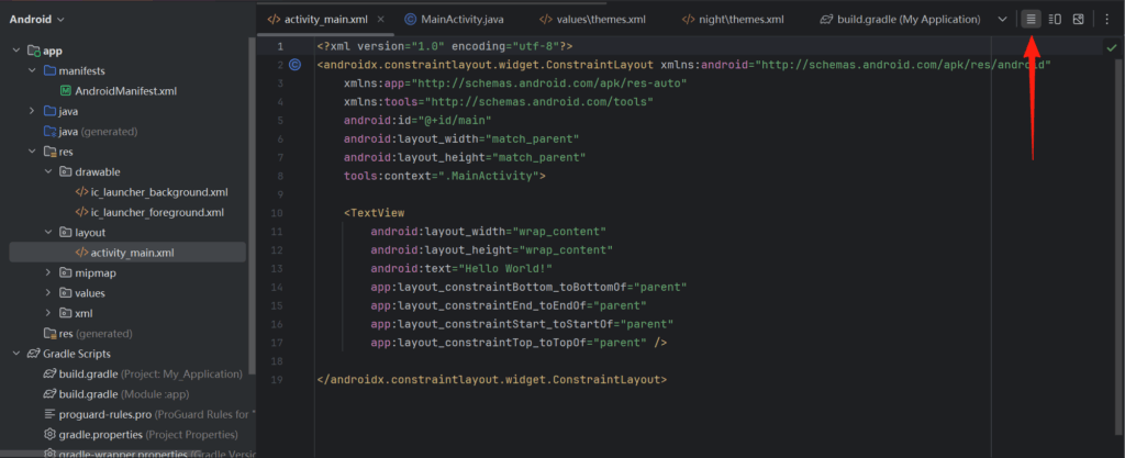
这次开始拖拽测试各种控件,先打开activity_main.xml,这个页面是默认页面,上一节已经存在的了,然后切换到源码视图.
默认已经有一个TextView,我们尝试改一下.静态写法是这样的.
<TextView
android:id="@+id/tv_hello"
android:layout_width="wrap_content"
android:layout_height="wrap_content"
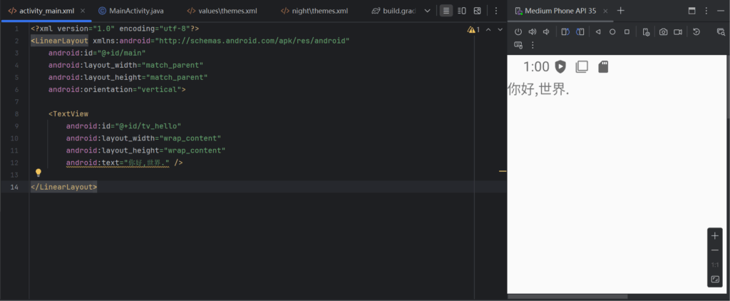
android:text="你好,世界." />然而什么都没发生,原来是教程里是LinearLayout,先不管是什么,把这个布局拉过来.
<?xml version="1.0" encoding="utf-8"?>
<LinearLayout xmlns:android="http://schemas.android.com/apk/res/android"
    android:layout_width="match_parent"
    android:layout_height="match_parent"
    android:orientation="vertical">

    <TextView
        android:id="@+id/tv_hello"
        android:layout_width="wrap_content"
        android:layout_height="wrap_content"
        android:text="你好,世界." />

</LinearLayout>
如果用教程的带ActionBar的会发生错误Padding,所以就选没ActionBar,显示效果.
当然程序中可以写的,也能对显示内容设置.
tv_hello = findViewById(R.id.tv_hello);
tv_hello.setText("Hello World!");
就能看到文本改变了.

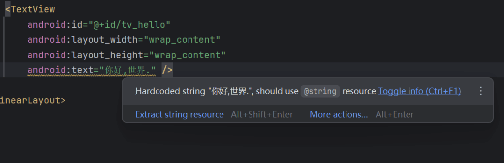
记得这里有一个警告,他建议我们把这些都塞到String资源里.
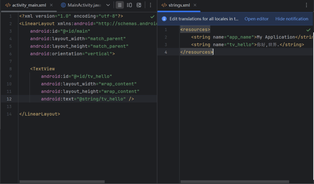
处理后是这样的.
字符除了内容,还可以设置大小,Android单位有3种,px,dp和sp,默认setTextSize方法单位是sp,也是推荐单位,他会根据系统设置的字体大小而一起改变.
tv_hello.setTextSize(30);除了字体大小,还可以设置字体颜色,颜色是ARGB,比如0x00FF0000是透明的红色,自然什么都看不到,还内置了很多预制颜色.
tv_hello.setTextColor(Color.BLUE);就像字符串资源一样,颜色也会在colors.xml预定义,这样也可以在setTextColor引用.
tv_hello.setTextColor(R.color.black);同理还有setBackgroundColor这里就不展开讲了,再说就很像写手册了.
前面说控件的时候,提到了一个概念,视图,而前面用的是线性视图,也只放了一个元素,他自然的就放在左上角靠着了.而且每个控件都有自己的layout_width和layout_height,也是需要设置的.
- wrap_content 内容自适应,大小就是内容的大小,但只有这个属性可以被Java代码中动态变更大小.
- match_parent 与父级一样大小,上级的尺寸是多大,他就多大.
- 以dp为单位的具体大小,不管内容多大,控件大小都是这么大.
前面说的,布局里的单位是dp,而设置属性的参数单位是px,所以还需要涉及到转换.
public class Utils {
    // 根据手机的分辨率从 dp 的单位 转成为 px(像素)
    public static int dip2px(Context context, float dpValue) {
        // 获取当前手机的像素密度(1个dp对应几个px)
        float scale = context.getResources().getDisplayMetrics().density;
        return (int) (dpValue * scale + 0.5f); // 四舍五入取整
    }

    // 根据手机的分辨率从 px(像素) 的单位 转成为 dp
    public static int px2dip(Context context, float pxValue) {
        // 获取当前手机的像素密度(1个dp对应几个px)
        float scale = context.getResources().getDisplayMetrics().density;
        return (int) (pxValue / scale + 0.5f); // 四舍五入取整
    }
}
然后通过这个方法修改
ViewGroup.LayoutParams layoutParams = tv_hello.getLayoutParams();
layoutParams.width = Utils.dip2px(this,300);
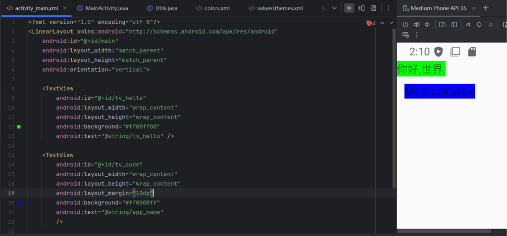
tv_hello.setLayoutParams(layoutParams);两个标签之间可以通过layout_margin修改.
关于布局上说的也太多了,再继续说,也是直接复制文档了.下面进行一些总结.
LinearLayout (线性布局)
1. 基本概念
- 子元素按垂直或水平方向线性排列
- 它是最简单也最常用的布局之一
2. orientation 属性
- 控制子元素排列方向:
android:orientation="horizontal"横向排列(从左到右)android:orientation="vertical"纵向排列(从上到下)
3. weight 权重
- 属性:
android:layout_weight - 分配剩余空间用的,可以实现“按比例分配空间”的效果
- 例如:
  <LinearLayout android:orientation="horizontal" ...>
      <TextView android:layout_weight="1" ... />
      <TextView android:layout_weight="2" ... />
</LinearLayout>- 第一个占 1/3,第二个占 2/3 的宽度(前提是
layout_width="0dp")
4. 其他常用属性
android:gravity:控制子元素对齐方式android:layout_gravity:控制该子元素在父容器中的对齐android:baselineAligned:默认 true,用于对齐文字基线(适用于纵向布局)
RelativeLayout (相对布局)
1. 基本概念
- 子元素根据其他子元素或父容器的位置进行布局
- 灵活但可能会让层级关系变复杂
2. 常用布局属性(在子元素中设置)
- 相对于父容器:
layout_alignParentTop/Bottom/Left/Right:贴紧父容器的边layout_centerInParent:水平和垂直居中layout_centerHorizontal/Vertical- 相对于兄弟控件:
layout_toRightOf/layout_toLeftOf/layout_above/layout_belowlayout_alignTop/Bottom/Left/Right:对齐参考控件的边界
3. 示例
<RelativeLayout ...>
    <TextView
        android:id="@+id/title"
        android:layout_alignParentTop="true"
        android:layout_centerHorizontal="true" />

    <Button
        android:layout_below="@id/title"
        android:layout_alignParentRight="true" />
</RelativeLayout>
GridLayout (网格布局)
1. 基本概念
- 按照行和列的网格系统进行布局
- 类似 HTML 的表格,适合均匀排布的元素
2. 属性(父布局)
android:rowCount:行数android:columnCount:列数
3. 属性(子元素)
layout_row:指定所在行layout_column:指定所在列layout_rowSpan:跨多少行layout_columnSpan:跨多少列layout_gravity:控制元素在单元格中的对齐方式
4. 示例
<GridLayout
    android:columnCount="2"
    android:rowCount="2" ... >

    <Button
        android:text="A"
        app:layout_row="0"
        app:layout_column="0" />

    <Button
        android:text="B"
        app:layout_row="0"
        app:layout_column="1" />
</GridLayout>
ScrollView (滚动视图)
1. 基本概念
- 单一方向的滚动容器:垂直滚动的
ScrollView水平滚动的HorizontalScrollView - 只能包含一个子元素(可以是布局容器,如 LinearLayout)
2. 垂直滚动:ScrollView
<ScrollView>
    <LinearLayout android:orientation="vertical">
        <!-- 多个子控件 -->
    </LinearLayout>
</ScrollView>
3. 水平滚动:HorizontalScrollView
<HorizontalScrollView>
    <LinearLayout android:orientation="horizontal">
        <!-- 多个子控件 -->
    </LinearLayout>
</HorizontalScrollView>
4. 常用属性
android:fillViewport="true":让子元素拉伸填满 ScrollViewandroid:scrollbars="vertical" | "horizontal":控制滚动条显示android:fadingEdge="none":去掉边缘阴影android:overScrollMode:是否允许拖动超出边界(比如弹性效果)